Adjusting heatmaps for population: addressing XKCD 1138
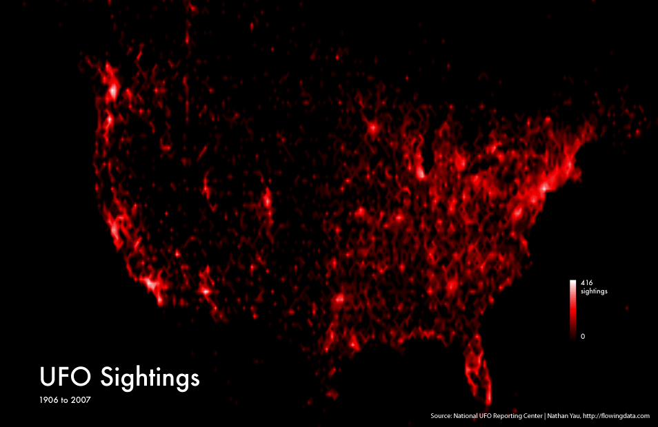
In Machine Learning for Hackers by Drew Conway and John Myles White, they introduce a data set of UFO sightings as an example. Googling around for other work on this data set produces some heatmaps of the sightings, here is one from flowingdata.com:
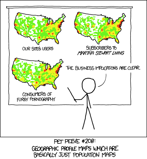
I was immediately reminded of the XKCD comic:
I decided to try adjusting the UFO sightings data for population, something I've never done before. Are UFO sightings distributed according to population? Or do some areas get more than their fair share of sightings?
TL;DR
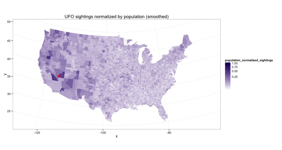
The western US gets a lot more sightings than the population would suggest, especially near Area 51. Read on to follow my data adventure.
A little bit more
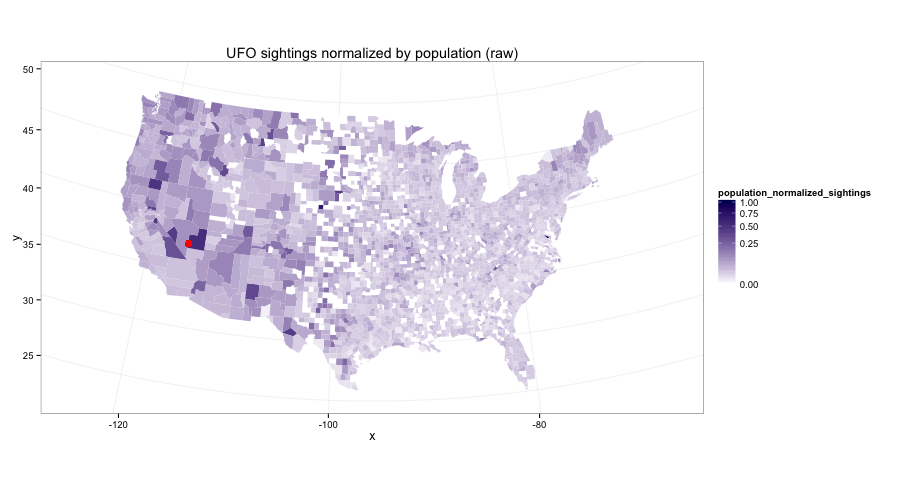
I used Python to wrangle the data and ggplot2 from R to make the plots. The actual raw data looks like this:
I explored a couple different ways to smooth that out and arrive at the final image, which all gave pretty much the same result. Specifically, I looked at:
- a beta-binomial maximum likelihood approach
- the R library lme4 for linear mixed-effects models
- the probabilistic programming language Stan
Up Next
Obtaining and cleaning the data
This details the tedious process I went through to arrive at the 'raw' map above.
Here I show how I came up with the smoother map.