import numpy as np
import pandas as pd
%load_ext rmagic
%R library(ggplot2)
%R library(lme4)
%R theme_set(theme_bw());
Loading required package: Matrix
Loading required package: Rcpp
A quick recap from part 2. We ended up with data that looks like this:
data = pd.read_csv('https://s3.amazonaws.com/sean_harnett/ufo_data.csv', index_col=0)
data.eval('raw_rate = num_sightings/population')
data.head()
Plotting it on a map of the US looks like this:
%%R -i data -w900
counties <- map_data("county")
counties$region <- do.call(paste, c(counties[c("region", "subregion")], sep = " "))

p <- ggplot(data, aes(map_id=state_county))
p <- p + geom_map(aes(fill=raw_rate), map=counties)
p <- p + expand_limits(x=counties$long, y=counties$lat)
p <- p + coord_map("conic", lat0=30) + scale_fill_gradientn(trans="sqrt", colours=c('white', '#640000'))
p + ggtitle('UFO sightings adjusted for population (raw)') + xlab('long') + ylab('lat')
Error in eval(expr, envir, enclos) : object 'raw_rate' not found

This looks a bit odd, as if something special is happening in the middle of the country. The phenomenon is discussed in Bayesian Data Analysis, by Andrew Gelman, John Carlin, Hal Stern, David Dunson, Aki Vehtari, and Donald Rubin:
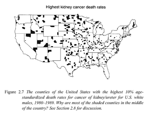
The book then shows the same picture for counties with the lowest cancer rates. That picture looks about the same, with shaded counties mostly in the middle of the country.
The answer is that these counties have very small populations, and so are more susceptible to small random fluctuations in the data. There are a number of ways to address the problem.
Method 1: beta-binomial empirical Bayes
Recall that we're looking at UFO sightings over a twenty year period. Suppose we want to estimate the number of sightings over the next twenty years, and let's ignore changes in population over time. Further simplifying things, let's say each person in a county $c$ has a fixed probability $p_c$ of seeing a UFO in a twenty year span. We want to estimate $p_c$ for each county. For convenience we assume the $p_c$ follow a beta distribution, which is a pretty flexible probability distribution over $[0,1]$ which takes two parameters $\alpha$ and $\beta$. We'll want to estimate these from our data as well.

This is a pretty common set-up called the beta-binomial distribution: we have a number of different binomial observations (number of sightings and population for each county), where the probability of success for the different binomials is beta distributed.
Once we have $\alpha$ and $\beta$, we'll treat them as pseudocounts, where $\alpha$ represents an extra number of sightings and $\beta$ an extra number of people that didn't see a UFO. We now estimate each $p_c$ by
$$ p_c \approx \frac{N + \alpha}{P + \alpha + \beta} $$
where $N$ is the number of sightings in county $c$ and $P$ is the population. This is a sort of empirical Bayes method. Notice that for small $N$ and $P$, the estimate is approximately $\frac{\alpha}{\alpha + \beta}$, but as $N$ and $P$ get large the effect of $\alpha$ and $\beta$ goes away and the estimate approaches the empirical rate $\frac{N}{P}$.
To get a ball-park idea of what the best choice for $\alpha$ and $\beta$ might be, let's look at the distribution of the sightings rate for counties with large populations. These should be closer to their 'true' rates than the small population counties.
%matplotlib inline
print(data.query('population >= 100000').raw_rate.describe())
data.query('population >= 100000').raw_rate.hist(normed=True);

Looks like it's centered around 1e-4 and drops off to almost nothing at around 5e-4. After a little guess and check, I get $\alpha=1.5$ and $\beta=10000$ is in the ball park:
import matplotlib.pyplot as plt
from scipy.stats import beta as beta_dist
p = np.linspace(0, .001, 100)
alpha = 1.5
beta = 10000
b = beta_dist.pdf(p, alpha, beta)
data.query('population >= 100000').raw_rate.hist(normed=True);
plt.plot(p, b);

I'll find the 'best' beta-binomial parameters $\alpha$ and $\beta$ using maximum likelihood. The parameters delta and mu below are for regularization that's useful in a another context that I use this in. We'll use the ball-park figures for $\alpha$ and $\beta$ as the initial point for the optimization.
from numpy import array, mean, inf
from scipy.optimize import fmin_l_bfgs_b
from scipy.special import gammaln as lg, polygamma
dg = lambda x: polygamma(0, x)

class BetaBinomial(object):
    ''' finds optimal alpha and beta parameters for a beta-binomial fit. uses L2
        regularization on the sum alpha+beta. The penalty term is
        delta*(alpha+beta-mu)^2 '''
    def __init__(self, delta=1e-6, mu=30, x0=array([3,27])):
        self.delta = delta
        self.mu = mu
        self.x0 = x0
    def likelihood(self, x, a, b):
        if a<=0 or b<=0:
            return -inf
        k, n = x[:,0], x[:,1]
        return mean(lg(a+b)-lg(a)-lg(b) + lg(a+k) + lg(b+n-k) - lg(a+b+n))
    def Dlikelihood(self, x, a, b):
        k, n = x[:,0], x[:,1]
        Da = mean(dg(a+b)-dg(a) + dg(a+k) - dg(a+b+n))
        Db = mean(dg(a+b)-dg(b) + dg(b+n-k) - dg(a+b+n))
        return array([Da, Db])
    def reg(self, a, b):
        return -self.delta*(a+b-self.mu)**2
    def Dreg(self, a, b):
        Da = -2*self.delta*(a+b-self.mu)
        Db = -2*self.delta*(a+b-self.mu)
        return array([Da, Db])
    def f(self, ab, data):
        a,b = ab
        return (-(self.likelihood(data, a, b) + self.reg(a, b)),
                -(self.Dlikelihood(data, a, b) + self.Dreg(a, b)))
    def optimize(self, data):
        ''' data is two columns: [successes, trials] '''
        ans = fmin_l_bfgs_b(self.f,
                            self.x0,
                            pgtol=1e-6,
                            factr=1e3,
                            args=(data,),
                            bounds=[(0, None), (0, None)])
        if ans[2]['warnflag']:
            print(ans)
            raise
        a,b = ans[0]
        return a,b

def bb_optimize(data, delta=1e-6, mu=30, x0=array([3,27])):
    ''' data is two columns: [successes, trials] '''
    return BetaBinomial(delta, mu, x0).optimize(data)
alpha, beta = bb_optimize(data[['num_sightings', 'population']].values, delta=0, mu=0, x0=[1.5, 10000])
print(alpha, beta)
Now we get our updated estimates using the previous formula
$$ p_c \approx \frac{N + \alpha}{P + \alpha + \beta} $$
Let's scale it to per 10000 people per year, recalling the data is over a 20 year period.
data['smooth_rate1'] = (data.num_sightings+alpha)/(data.population+alpha+beta)*10000/20
Looking at these rates, the picture looks much smoother:
%%R -i data -w900
counties <- map_data("county")
counties$region <- do.call(paste, c(counties[c("region", "subregion")], sep = " "))

p <- ggplot(data, aes(map_id=state_county))
p <- p + geom_map(aes(fill=smooth_rate1), map=counties)
p <- p + expand_limits(x=counties$long, y=counties$lat)
p <- p + coord_map("conic", lat0=30)
p <- p + scale_fill_gradientn(trans="sqrt", colours=c('white', '#006400'), guide=guide_colorbar(title='UFO sightings per 10000 people per year'))
p <- p + geom_point(aes(y=37.235, x=-115.811111), color='red', size=3)
p <- p + ggtitle('UFO sightings adjusted for population (smoothed, maximum likelihood)') + xlab('long') + ylab('lat')
p

Method 2: linear mixed-effects models -- the lme4 R package
I don't know too much about this, but it achieves effectively the same thing.
%%R -i data
fit <- glmer(cbind(num_sightings, population-num_sightings) ~ 1 + (1|state_county), family=binomial, data=data)
data$smooth_rate_glmer <- predict(fit, type="response")*10000/20
The general story looks the same, though looking over at the legend, it seems the estimates are a bit more extreme in this method.
%%R -w900
counties <- map_data("county")
counties$region <- do.call(paste, c(counties[c("region", "subregion")], sep = " "))

p <- ggplot(data, aes(map_id=state_county))
p <- p + geom_map(aes(fill=smooth_rate_glmer), map=counties)
p <- p + expand_limits(x=counties$long, y=counties$lat)
p <- p + coord_map("conic", lat0=30)
p <- p + scale_fill_gradientn(trans="sqrt", colours=c('white', '#006400'), guide=guide_colorbar(title='UFO sightings per 10000 people per year'))
p <- p + geom_point(aes(y=37.235, x=-115.811111), color='red', size=3)
p <- p + ggtitle('UFO sightings adjusted for population (smoothed, lme4)') + xlab('long') + ylab('lat')
p

Method 3: Stan
While the first two methods were simply approximations, with the program Stan we can get the proper full Bayesian model. It can be pretty slow, so to test things out I generated some fake data with the same structure as ours.
In this fake data, there are $N = 50$ counties. The UFO sightings rates $p_c$ are beta distributed with parameters $\alpha=3$ and $\beta=27$. The population of each county $n$ is geometrically distributed with parameter .01 (mean 100):
from pystan import stan, StanModel
from scipy.stats import beta, binom, geom
Fake data
N = 50
a, b = 3, 27
p_c = beta.rvs(a, b, size=N)
n = geom.rvs(.01, size=N)
k = [binom.rvs(_n, _p) for _p, _n in zip(p_c, n)]
fake_data = DataFrame(dict(p_c=p_c, k=k, n=n))
print(len(fake_data))
fake_data.head()
%%time
model_code = '''
data {
    int<lower=0> N;
    int<lower=0> k[N];
    int<lower=0> n[N];
}
parameters {
    real<lower=0,upper=1> theta[N];
    real<lower=0,upper=1> mu;
    real<lower=0> M;
}
transformed parameters {
    real<lower=0> a;
    real<lower=0> b;
    real<lower=2> tau;
    tau <- M+2;
    a <- mu*tau;
    b <- (1-mu)*tau;
}
model {
    mu ~ uniform(0, 1);
    M ~ exponential(.001);
    theta ~ beta(a, b);
    k ~ binomial(n, theta);
}
'''
sm = StanModel(model_code=model_code)
N = len(fake_data)
k = fake_data.k.astype(int).values
n = fake_data.n.astype(int).values
%%time
stan_data = dict(N=N, k=k, n=n)
fit = sm.sampling(data=stan_data)
a_samples = Series(fit.extract()['a'])
b_samples = Series(fit.extract()['b'])
t_samples = DataFrame(fit.extract()['theta'])
fake_data = pd.read_csv('fake_data.csv')
fake_data.columns = ['k', 'n', 'p_c']
a_samples = pd.read_csv('stan_test_results/a_test_samples.csv', index_col=0, header=None)
b_samples = pd.read_csv('stan_test_results/b_test_samples.csv', index_col=0, header=None)
t_samples = pd.read_csv('stan_test_results/t_test_samples.csv', index_col=0)
a_est, b_est = a_samples.values.mean(), b_samples.values.mean()
mean_est = a_est/(a_est+b_est)
a_est, b_est, mean_est, fake_data.k.sum()/fake_data.n.sum()
(4.5837921058580671,
 36.170253799395454,
 0.1124745287011413,
 0.11116469737159393)
Recall here that $p_c$ is the 'actual' binomial probability that generated the data. 'raw' is simply $\frac{k}{n}$. Observe that the Stan estimate is between the raw rate and the group average .111.
fake_data.eval('raw = k/n')
fake_data['stan_estimate'] = t_samples.mean().values
fake_data.head(10)
Real data
My laptop couldn't handle this, so I ran it on a pretty powerful desktop.
from pandas import DataFrame, Series, read_csv
from pystan import stan, StanModel

data = read_csv('data.csv')
N = len(big_data)
k = big_data.num_sightings.astype(int).values
n = big_data.population.astype(int).values

model_code = '''
data {
    int<lower=0> N;
    int<lower=0> k[N];
    int<lower=0> n[N];
}
parameters {
    real<lower=0,upper=1> theta[N];
    real<lower=0,upper=1> mu;
    real<lower=0> M;
}
transformed parameters {
    real<lower=0> a;
    real<lower=0> b;
    real<lower=2> tau;
    tau <- M+2;
    a <- mu*tau;
    b <- (1-mu)*tau;
}
model {
    mu ~ uniform(0, 1);
    M ~ exponential(1e-5);
    theta ~ beta(a, b);
    k ~ binomial(n, theta);
}
'''
sm = StanModel(model_code=model_code)

stan_data = dict(N=N, k=k, n=n)
fit = sm.sampling(data=stan_data)

a_samples = Series(fit.extract()['a'])
b_samples = Series(fit.extract()['b'])
t_samples = DataFrame(fit.extract()['theta']) # this is pretty big, so let's only save some statistics of interest
a_samples.to_csv('alpha_samples.csv')
b_samples.to_csv('beta_samples.csv')
t_samples.mean().to_csv('theta_means.csv')
t_samples.median().to_csv('theta_medians.csv')
alpha_samples = pd.read_csv('stan_real_results/alpha_samples.csv', index_col=0, header=None)
beta_samples = pd.read_csv('stan_real_results/beta_samples.csv', index_col=0, header=None)
theta_means = pd.read_csv('stan_real_results/theta_means.csv', index_col=0, header=None)
theta_medians = pd.read_csv('stan_real_results/theta_medians.csv', index_col=0, header=None)
I think there were some junky samples in there when I was playing with this, and the median is more robust to outliers, so let's try that too.
data['stan_rate_means'] = theta_means*10000/20
data['stan_rate_medians'] = theta_medians*10000/20
data[['state_county', 'population', 'num_sightings']].to_csv('big_data_stan.csv')
Same old story.
%%R -i data -w900
counties <- map_data("county")
counties$region <- do.call(paste, c(counties[c("region", "subregion")], sep = " "))

p <- ggplot(data, aes(map_id=state_county))
p <- p + geom_map(aes(fill=stan_rate_means), map=counties)
p <- p + expand_limits(x=counties$long, y=counties$lat)
p <- p + coord_map("conic", lat0=30)
p <- p + scale_fill_gradientn(trans="sqrt", colours=c('white', '#006400'), guide=guide_colorbar(title='UFO sightings per 10000 people per year'))
p <- p + geom_point(aes(y=37.235, x=-115.811111), color='red', size=3)
p <- p + ggtitle('UFO sightings adjusted for population (smoothed, Stan posterior means)') + xlab('long') + ylab('lat')
p

%%R -i data -w900
counties <- map_data("county")
counties$region <- do.call(paste, c(counties[c("region", "subregion")], sep = " "))

p <- ggplot(data, aes(map_id=state_county))
p <- p + geom_map(aes(fill=stan_rate_medians), map=counties)
p <- p + expand_limits(x=counties$long, y=counties$lat)
p <- p + coord_map("conic", lat0=30)
p <- p + scale_fill_gradientn(trans="sqrt", colours=c('white', '#006400'), guide=guide_colorbar(title='UFO sightings per 10000 people per year'))
p <- p + geom_point(aes(y=37.235, x=-115.811111), color='red', size=3)
p <- p + ggtitle('UFO sightings adjusted for population (smoothed, Stan posterior medians)') + xlab('long') + ylab('lat')
p

!date